
Malton Vineyard - Bottle Label Design
I was commissioned by Malton Vineyard, a family-run vineyard in North Yorkshire, to design their first-ever wine labels. As a new brand entering the market, the client wanted labels that felt premium and unique, while showcasing the vineyard’s stunning landscape as a central feature.
After successfully launching their wines, I was later invited to create a matching design for their new cider range, ensuring consistency while giving the cider bottles their own distinct identity.
The Brief
The goals of the project were clear:
-
Create a premium, timeless label design for their debut wine collection.
-
Incorporate a sketch of the vineyard landscape to reflect the origin of the product.
-
Design a flexible layout that could be adapted for future wine varieties and additional products.
-
For the cider range, retain the gold accents used in the wine branding but introduce a bolder, more modern twist to differentiate the product.
The Design Process
Step 1 – Capturing the Vineyard
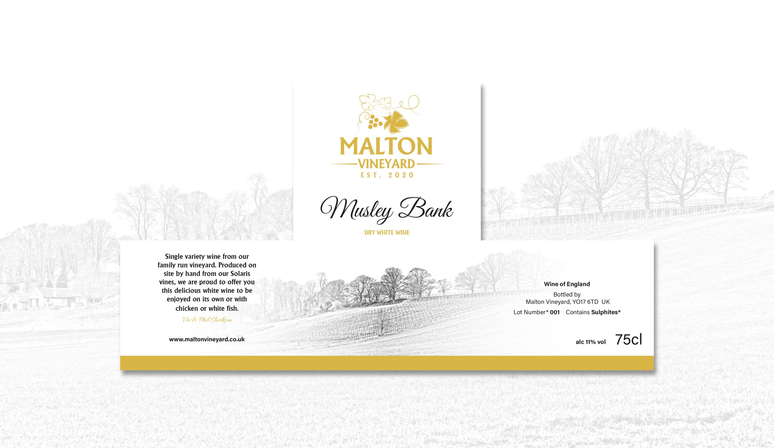
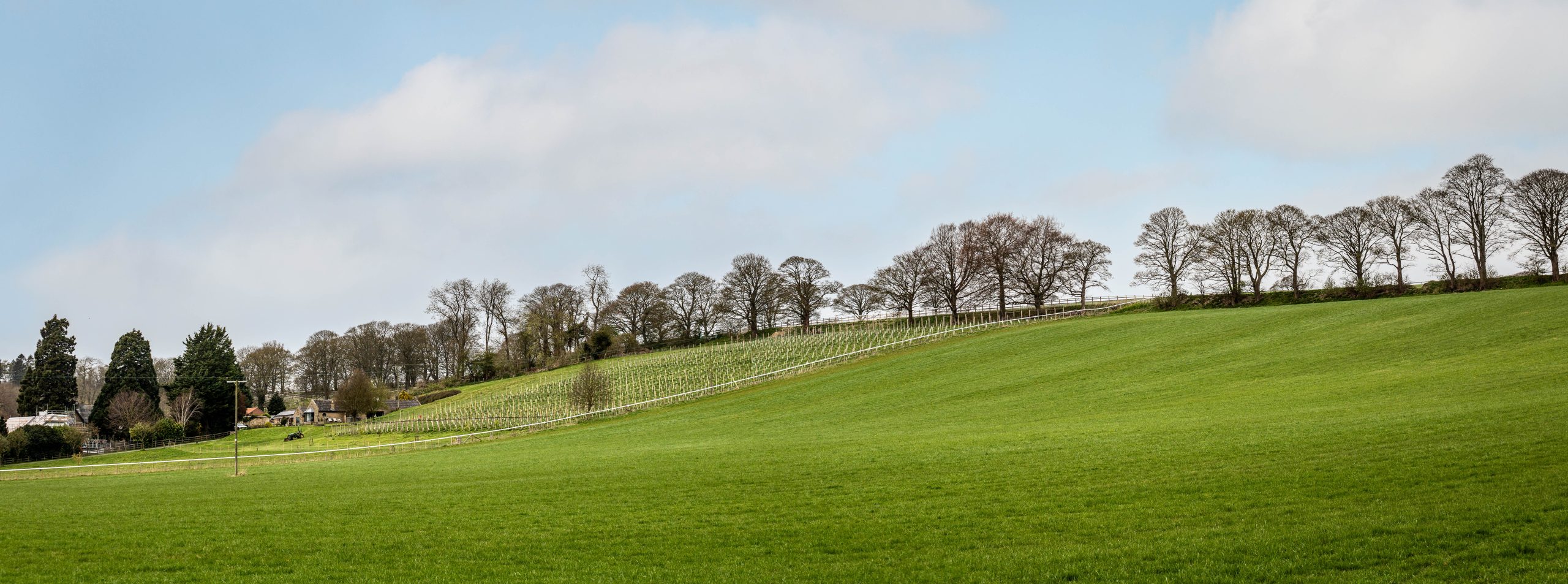
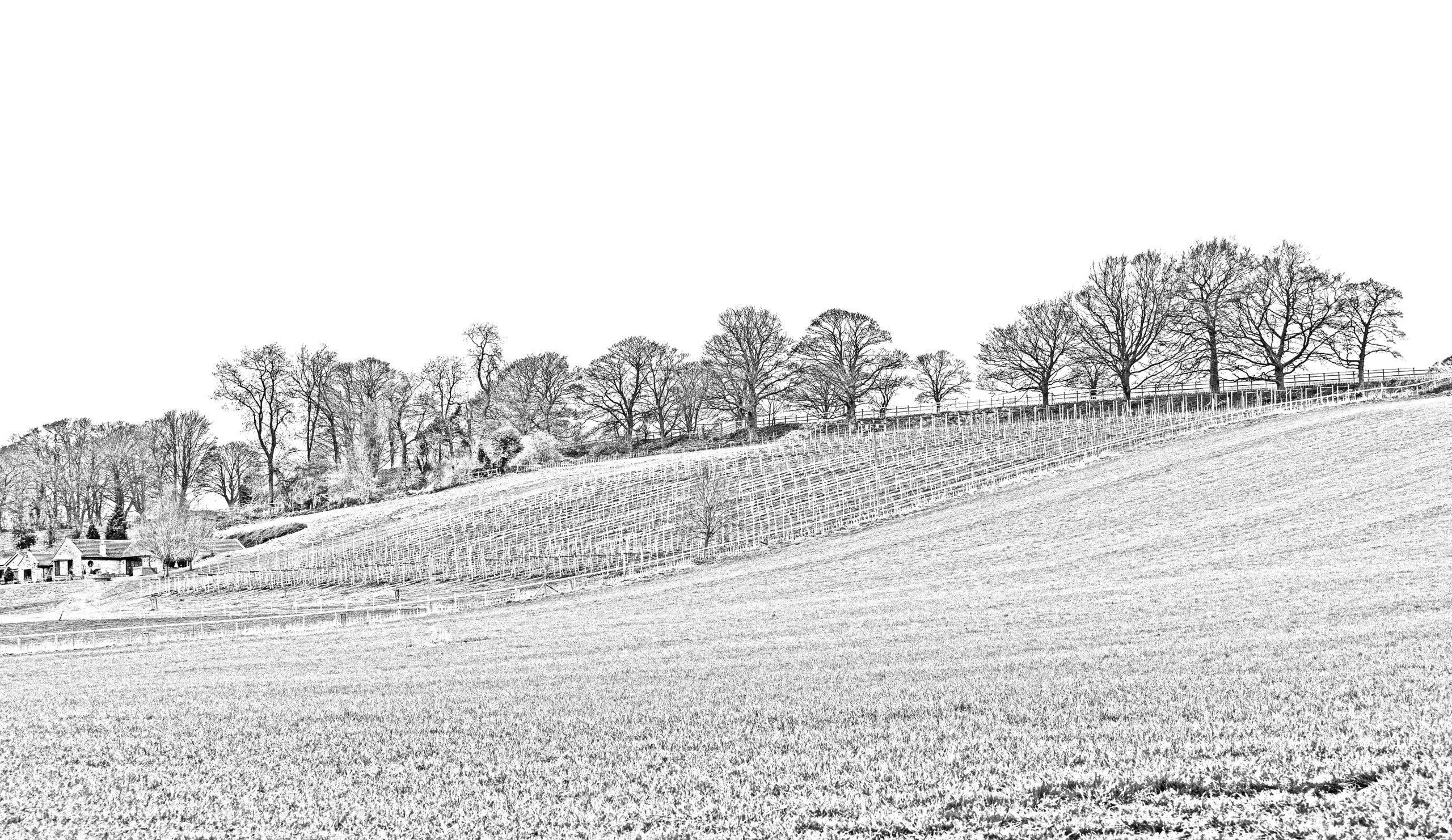
To bring authenticity to the design, I visited the vineyard to photograph the landscape. This allowed me to create a detailed line sketch of the vineyard, which became the signature background artwork for the wine labels.
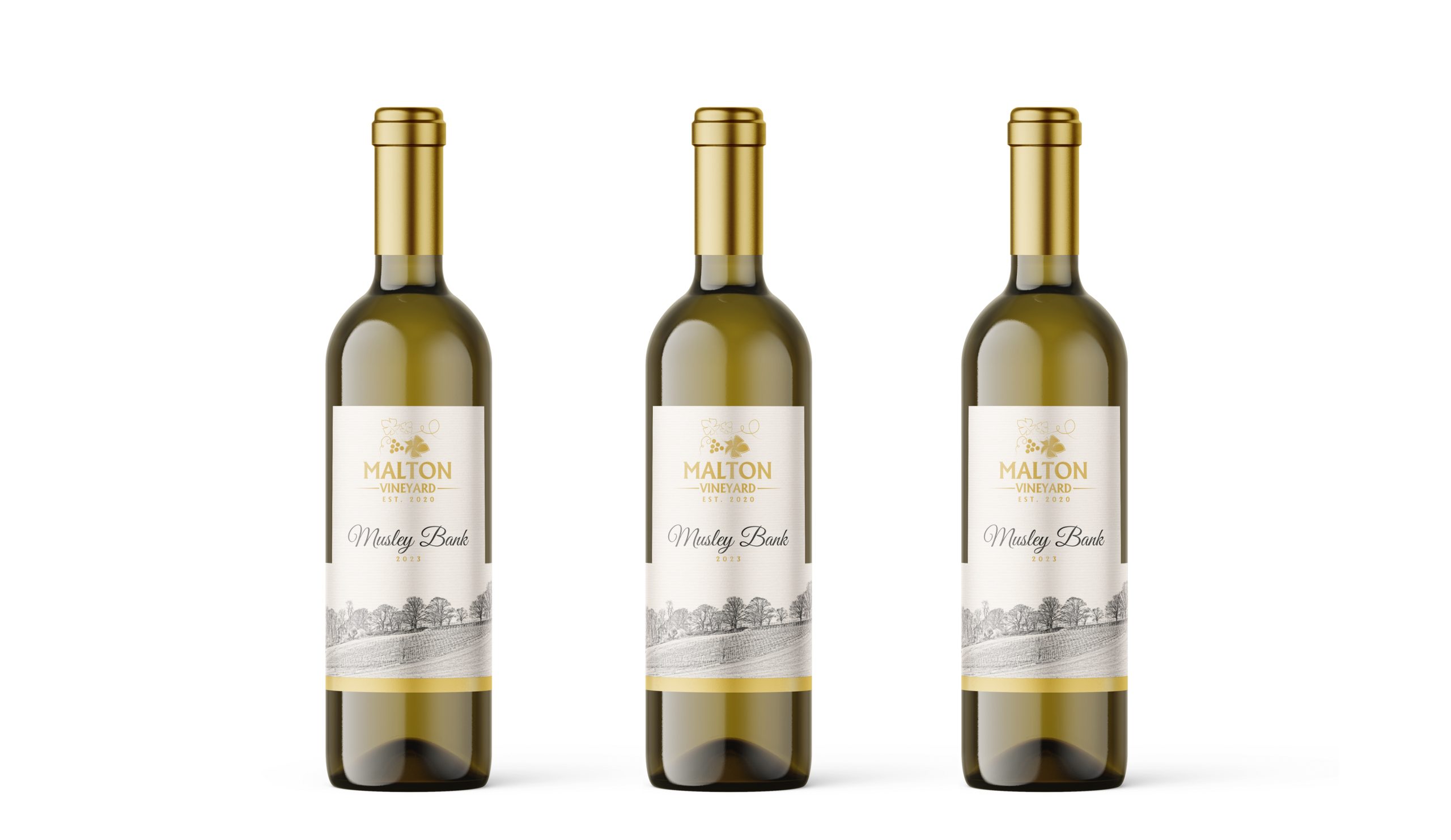
Step 2 – Wine Label Design
For the wine range, we opted for a clean, elegant layout with side tabs. These tabs provided a space for vintage and varietal information while leaving the main panel free to highlight the vineyard sketch. The subtle gold detailing added a sense of luxury and sophistication, perfectly reflecting the quality of the wine.
Step 3 – Expanding into Cider
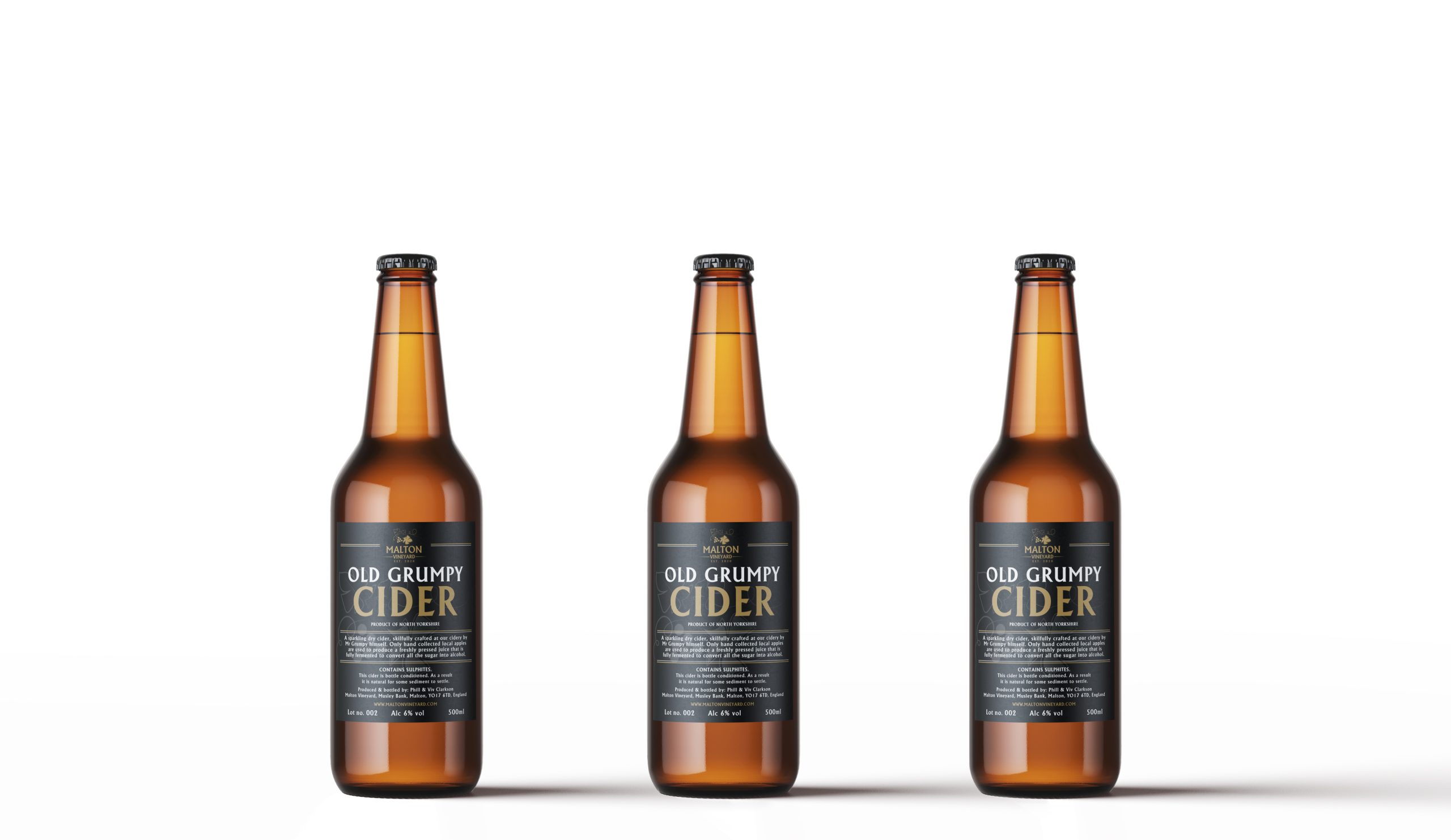
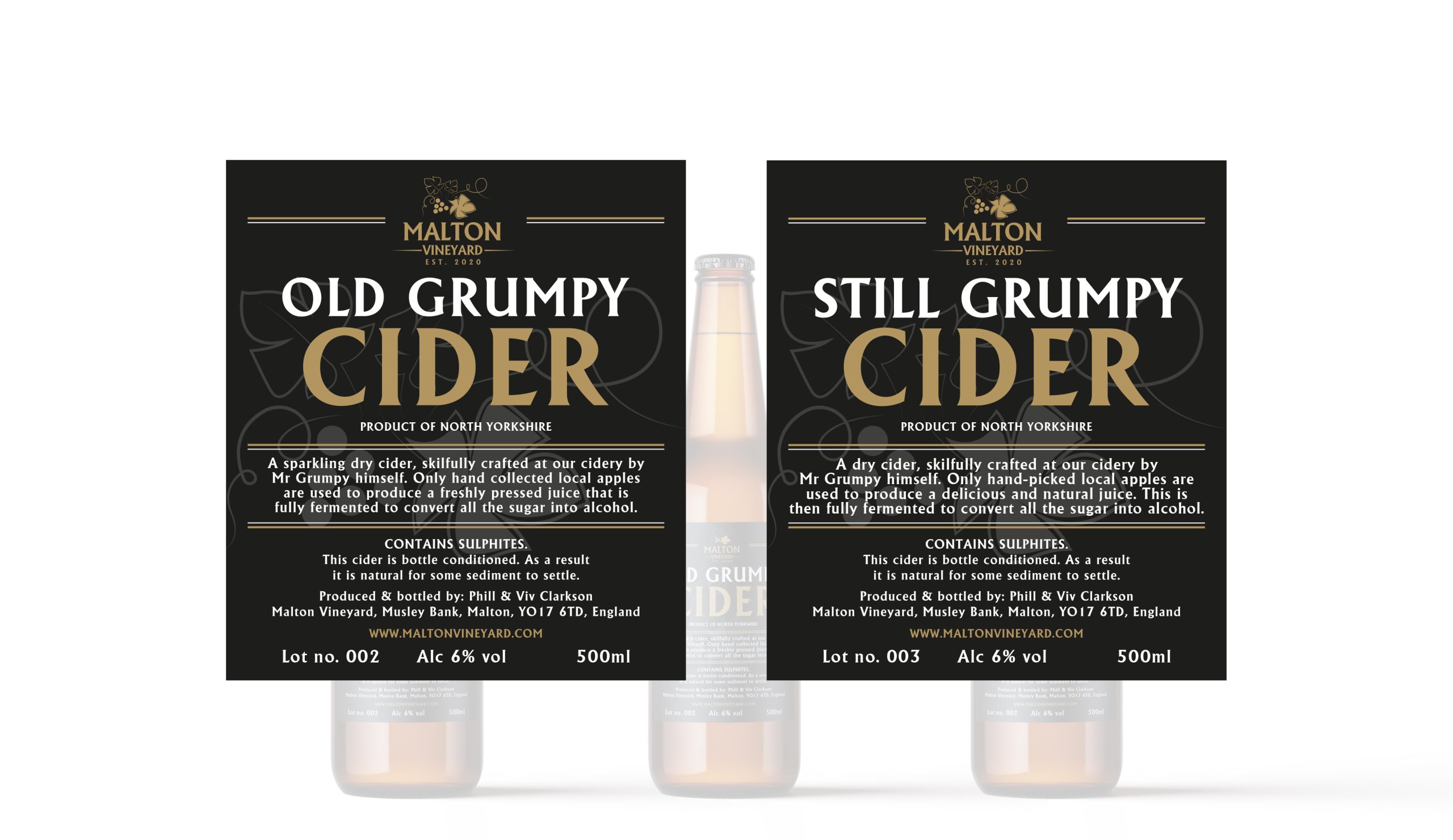
After establishing their wine branding, Malton Vineyard began producing cider using the same wine press and approached me to create cider labels.
To keep the branding cohesive, I retained the gold accents from the wine labels but introduced a black background and moved all key information to the front of the label, as requested by the client. This bold contrast created a distinctive look while maintaining brand recognition.
The Result
The finished designs give Malton Vineyard a polished, professional identity across both their wine and cider ranges. The vineyard sketch ties the products together visually, while the thoughtful use of colour and layout makes each label stand out on the shelf.
The labels not only tell the story of the vineyard but also create a premium feel that resonates with customers and supports the growth of the brand.